
Picture Book Illustration Using Procreate

Values


The sketch
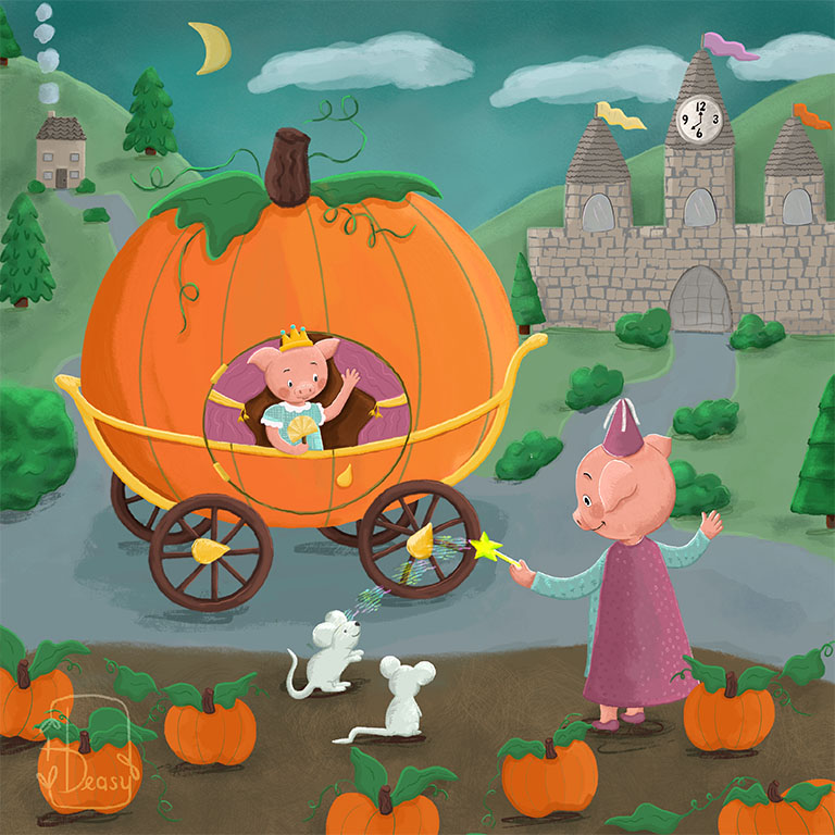
There are so many wonderful scenes in Cinderella, but I love the scene when the fairy godmother works her magic. The ball gown, the pumpkin carriage, the mice turned into horses. Here we are placed in the story mid-scene. Cinderella is ready, but the carriage still needs horse power.
Painting in progress
I always have a color palette in mind, but sometimes it just isn’t working. I keep adding laying in flat color knowing that I can easily make adjustments. Once the illustration is painted, I can look at it as a whole. In this version, I want the greens and blues to be less saturated. I make adjustments before I continue shading and adding texture.


Checking the values
Once the illustration is painted with colors I’m happy with, I check the values using the hue layer mask in Procreate. This illustration’s values are a bit too close so I keep checking as I make adjustments.
After value adjustments
An art teacher once taught me a quick way to check values. Do the squint test on your illustrations. Any areas that need to stand out but don’t, need to be adjusted. This version looks much better than the above version.


Shading and textures
With the values taken care of, I move on to shading and adding textures. I love this part because it’s when the illustration really starts to look and feel like my style.
Making Changes
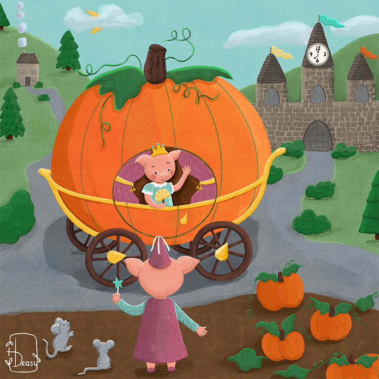
And finally, here’s what the illustration looks like after receiving some wonderful feedback from illustrator friends. It’s always helpful when someone critiques my work. Fresh eyes see things I don’t. Can you spot all the changes?


